Will your lunch get you an A?

In this assignment, I chose a dataset on exam scores of students with data such as ethnicity, parental education, lunch preference, whether or not they did test preparation, and the scores on three standardized tests. This is the site from which I found the data, https://www.kaggle.com/datasets/whenamancodes/students-performance-in-exams?resource=download.

The questions I wanted to answer.

Overall did more students pass or fail? Did the ones who completed the test review gain an advantage? Was there any significance between the students’ average test scores and their lunch opportunities, Did students of parents with higher education have an advantage on math exams? Does gender affect writing scores?

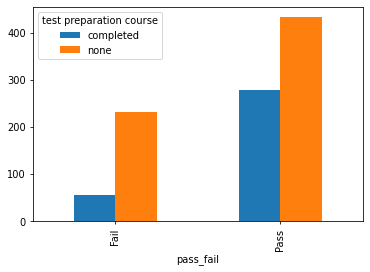
To begin solving my first question did the students who did the test review gain an advantage? To begin I added all the tests for each student to get their average of the three tests and if the average was over or equal to 60% that is considered a pass below is a fail. The frequency of the pass-fail was 713 passes and 287 fails. I then compared this to the number of students that completed the test preparation course. Here is that graph.

As we can see of the students who passed their tests around 40% of the students completed their preparation course. and of those who failed around 17% took the preparation course. Now, what does this mean, in my conclusion, I would like to think that 40% who took the test prep most likely scored higher than those who passed without the prep. And those who failed while still completing the prep most likely didn’t fully understand the material.

My next question was if there was any significance between the student’s average test scores and their lunch opportunity. To do so I used the other column I made which was the percentage of the student’s total test average compared to the two lunch options given free/reduced versus standard. Before running my test to see if it was even worth testing I created a notched box plot.

Free/reduced lunch scores are much lower than standard lunch scores with free and reduced peaking at around 97 but only have a Q3 of 70 and standard have a Q3 of around 81. As you can see there is no overlap on the notches between the two lunches and the average test scores for each, so we are good to run the T-Test.

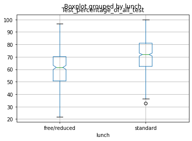
To run the T-test I made two separate arrays of the test scores separated by each lunch and ran them against each other getting a p-value of 3.18*10^-29. Seeing as this is way below 5% I was able to conclude that there is significance between which lunch students ate versus their average test scores.

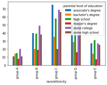
The next question I wanted to figure out was if there are any big differences between race/ethnicity and the parental education of the students, here is what I found.

I made a bar chart of the race and ethnicity on the x and the different colors represent the education the parents received. Looking at this plot you can see there is not anything crazy high or low for each race, the graph looks like there is a lot more in certain ethnicities like group c but that is just because more people from that ethnicity were sampled whereas in the group A ethnicity there were fewer people sampled in comparison.

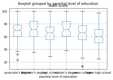
Another test I wanted to run was the math scores of students with parents with a master’s degree versus the parents with only some high school. Before doing so again I made a boxplot of all the parent’s education versus math scores and got this.

Again as I predicted the biggest difference was between the master’s degree parents and the same high school with master’s degrees Q3 around 83 and some high schools Q3 around 70. Seeing as there is no overlap in the notches I know it is now okay to run a T-test on these two separately. To do so first I made two separate arrays one of master’s and the other of some high school then ran them against each other getting a p-value of 1.23*10^-34 which like before is way below or alpha value so it is safe to assume there is a statistical significance between having a parent with a master’s degree or only some high school education and the math score the student received. The reason I was interested more in the math scores was that when growing up many kids who are struggling with math or need help go to their parents, so it is my hypothesis that if the student has a higher educated parent they have a better chance of receiving a good grade on their math test which was proven correct.

Another relationship I wanted to see was if there were any similarities in the writing versus reading test scores based on gender. Since these are both numeric values I made a scatter plot to show them versus each other. Here is what I found.

For starters, it is safe to say as writing scores go up so do reading scores, which is a good thing. This means if someone did good on a writing test they most likely also did well on the reading test. The reason I separated this by gender is just to see if there was any major difference in the males verse females when it came to reading or writing scores. and it seems there in fact are some big differences between males verse females. In both reading and writing, there was a larger chunk of females in a higher percentage than there are males.

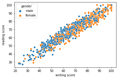
Now I decided to run a T-test on the data set of males versus females on writing scores and came out with a P-value of 2.96*10^-15 concluding that there is the significance that females tend to do better. One thing I noticed was that this was the highest or closest to 0.05 P-value of all my tests, if I had to guess it is because declaring something like this is significantly based on gender is hard to say whether it is correct or not. In the future running this on a bigger dataset would be beneficial.

Overall by choosing this data set I was able to analyze and predict a lot of new things when it came to students possibly receiving better test scores. I concluded that reviewing the test practice gave the student a much higher chance of receiving a better score than not doing it. I was able to see that free/reduced lunch versus standard lunch also had significance in receiving a better test score. I also ran a test to compare students with parents who had received a master’s degree verse kids with parents of only some high school education and compared those to the student’s scores on the math tests, because often when a student is struggling in math the first person they go to is their parents. I found that there was significance between the two parents’ education and the student’s math scores. I also compared writing versus reading scores based on gender in the form of a scatter plot and was able to conclude that females had higher test scores in both sections of the test, which is what I predicted because women tend to be better writers. In the future, I would like to test gender on writing scores with a bigger dataset, I would like to compare parental education to all test scores individually, I would like to have more columns such as was the student and athlete or possibly build a generator to add in if the student was an athlete at random. I also think adding more to the columns would help prove the statistical tests more right or wrong such as adding in if the student packed lunch.

Hotel Reservations do they actually show or cancel?

I chose this dataset because I found comparing if someone cancels their hotel reservation to the month, meal plan, etc very interesting. Overall this analysis I found a few things that I believe correlate some columns to if someone will cancel or stay with their reservation. The dataset I found was on Kaggle (https://www.kaggle.com/datasets/ahsan81/hotel-reservations-classification-dataset). I observed a lot in this dataset and found a lot of things interesting such as The fact that the fall months had the most reservations personally was expecting a summer month to be the highest, but I do understand traveling to more scenery-based places like the mountains is very common. I also found the difference in cancel verse non-cancel was about 75% compared to 25%. I did notice on the heatmap that although October had the highest reservations its balance of cancel to not canceling was close at around 3,500 showing and 2.500 not. Although in another month say December there were around 2.500 non-cancels and only around 400 cancels, assuming because a lot of people are visiting family and have some big priorities when it comes to travel.

This shows the number of reservations during certain months, so as you can see for example October has the most at a little over 5000 reservations made not separating canceled versus non-canceled just the total number.
So this bar plot shows the total canceled versus non-canceled reservations so again, for example, we see that in total there are around 24,000 reservations that were not canceled throughout one year and 12,500 reservations that were canceled in a year’s time.
This graph was another graph I made out of curiosity to see how many reservations there are based on the number of adults. So as I actually was expecting the most common number of adults on a reservation is going to be 2 at over 25,000 and the next being 3 at around 7,500 reservations.
Now combining two graphs, is a lot to look at but looking at what I said above let’s just break it down. so let’s look at the highest of each that I said so 2 adults and October is going to be around 3,600 at the highest point of the graph followed by a close second of 2 adults in September around 3,400.
This heatmap is a cross-tabulation between the arrival month and the booking status. So again let’s look at the highest and lowest the largest month is October as stated above with over 3,500 not canceled and around 2,000 canceled. and the lowest in January with less than 500 canceled and around 900-1,100 not canceled. These could be for a number of things. Here is some of my thinking a lot of people are just finished traveling for Christmas and have also most likely spent a good amount of money around Christmas so a lot of people are not going to be traveling in the early year months. And the fall time is a very common time again as we saw two adults going on little couples getaways and weekend dates.
So Now this heatmap is comparing the number of adults and the arrival month. So as expected the only super bright colors are around the 2 adults’ section again like I said in the later months like August, September, and October. With all reservations from 2,300 to 3,500. I would like to compare this with the booking status so we could see the heatmap of the number of adults per month and whether they canceled or not.

In conclusion, I can conclude that the highest month for hotel reservations will be October in both cancelation and non-cancelation, as for any month whatever months have the higher total reservations will most likely have a higher canceling rate but also a non-canceling rate.